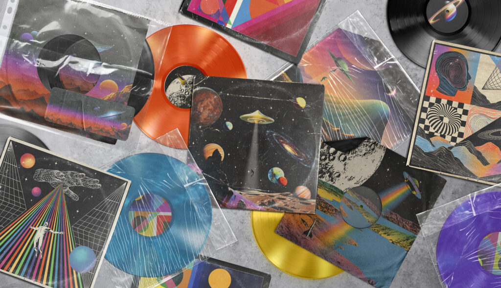
Striking cover art can be as long lasting as your sound as a musician it should hint at your themes and be instantly recognizable and who knows this article might help you create the next Dark Side of the Moon.
In the early years of your musical career, it might be easy to overlook cover art and visuals as you try to find your sound and refine your craft but, good cover art will help your visibility and develop your brand.
Think about the biggest artists of all time: Pink Floyd, The Beatles, Bob Dylan and Led Zeppelin as well as countless others, what’s one thing they all have in common? Instantly recognizable album covers, Everyone knows (or should know) Dark Side of the Moon, Abbey Road, The Freewheeling Bob Dylan and Led Zeppelin IV.
Here at Feedback, we interviewed some of the most interesting cover artists in the game right now to gauge their thoughts on the importance of cover art.
We spoke to:
Nibera Visuals aka Bernarda Conic, who has produced visuals for Kraftwerk, Aphex Twin and 808 State.
Jim Blackwell, who has produced work for Sam Lachow and Lifehouse.
And finally, Marcio Lima, who has worked for Snoop Dogg, Jim Jones, Too Short and Sexy Redd.
Now the intros are out of the way let’s hear their thoughts on what a good piece of cover art should do.
Bernarda said:
“In my view, a well-crafted cover artwork serves as a visual representation of the emotions and atmosphere encapsulated within the music.
“It has the potential to convey the underlying message of the music, adding an extra layer of depth to the listener’s experience.
“From a marketing standpoint, the cover plays a pivotal role as it serves as the initial point of contact for potential buyers. Therefore, it must captivate the audience and pique their curiosity.”
Marcio echoed these same sentiments of outlining themes of exploration for the musical project.
Marcio highlighted how cover art should ‘connect with your audience through images and not just sounds’ and it should also ’give a hint of what the content is like’.
Jim agreed, stating that what makes an album cover great is ‘the feeling it gives you when you re-listen to an album and see the details you missed the first time around in both the music and in the artwork itself, there’s something amazing about that’.
Tame Impala did this brilliantly with Currents, the album artwork serves as a gateway to walk through to his world of modern psychedelia which you can clearly hear in songs like The Less I Know The Better and Let It Happen.
Bernarda herself is known for abstract and psychedelic work (Tame Impala collaboration soon?) and this synergy between sound and sight is something she strives for.
She said: “Cover art achieves brilliance when it effectively captures and reflects the essence of the music’s genre, style, atmosphere and message, creating a visual representation that complements the auditory experience.
“Exceptional cover art possesses the ability to captivate and intrigue anyone who encounters it, drawing them into the musical world it represents.”
This being said it is still important to show your personality in pieces of cover art. The main goal for a piece of cover art should be the synergy between sight and sound as well as showing you or your band’s personalities and inspirations.
On the inspiration for cover art, we have already highlighted how it should link to your music but, where to start? For Marcio, some of his inspiration comes from watching TV.
He explained: “I’m a fan of cartoon shows and animes so that’s where my inspiration comes from. I love to watch Cartoon Network and Disney stuff even today. Also, things I like such as One Piece and Demon Slayer.”
Adding this more personal touch allows Marcio to have a more personal and unique product that leans on his interests. This is something no one else can replicate and in turn, gives you an instantly unique piece of cover art.
Jim tries things he thinks could work, experimenting and coming up with visuals using trial and error rather than leaning too much on outside sources for inspiration.
He said: “My main goal at all times with art is to keep trying things I want to try, the freedom of exploration in art is really what drew it to me in the first place so keeping that going is really paramount for me.”
Inspiration isn’t always easy to find so why not try to visualize and come up with 1001 different covers on a mood board and throw enough stuff at the wall and see what sticks…
Jim’s freedom within his art is always evident, as a quick scroll through his portfolio on Instagram will reveal surreal and vibrant examples of cover art, that upon viewing make you feel like you’ve dropped two tabs of LSD and are about to travel through space and time.
Now we’ve discussed the importance of cover art, what makes good examples of it and inspiration – it’s time to hear Bernarda’s and Jim’s opinions on the best album covers of all time, and what makes them great.
Bernarda went for a very classic top three and I’m not going to argue against a certain band’s inclusion being a proud Brummie…
She named her top three. “The first album cover that comes to mind and the one that’s probably my favourite is Pink Floyd’s “Dark Side of the Moon.” The minimalistic, iconic design with a prism refracting light against a black background is truly striking and has left a lasting impact.
“The next one that comes to mind is Nick Drake’s “Pink Moon” cover art. The art itself is a masterpiece, featuring a surreal and otherworldly portrayal of a pink moon, which definitely captivates and sparks curiosity in potential listeners.
“Lastly, the cover art for “Out of the Blue” by Electric Light Orchestra stands out for me. It features a retro-futuristic design with a prominent spaceship, perfectly complementing the space-age twist of the music within.”
Now, we’ve mentioned Dark Side Of The Moon a few times already but, that is only a testament to its lasting and unchallenged reign as the most iconic and recognisable album cover of all time. It clearly links to the themes of Pink Floyd’s project space-time and creating beauty (the rainbow) from the seemingly dull. Just think about Comfortably Numb; the song breaks into a mesmerizing guitar solo which feels like the listener is being showered in light and wonder, which is just the sense the album cover creates.
Nick Drakes, Pink Moon instantly captures your attention and intrigue as to what the listening experience would be thanks to its surreal nature.
ELO’s, Out Of The Blue Perfectly captures the auditory experience within. I can’t sum it up better than Bernarda did but it is a true gateway to ELO’s futuristic, space-age and experimental sound that is expertly refined by Jeff Lynne’s world-famous production and composition skills. The album cover just works. I can imagine Sweet Talking Woman blasting on the spaceship’s speakers and if that’s not synergy between visuals and music I don’t know what is.
Jim took a step away from the iconic rock albums of yesteryear and opened with one of the biggest rap albums of the 21st century.
He said: “A lot of people will disagree with my answers but I guess that’s what keeps art interesting Kendrick Lamar, DAMN. – A lot of people slated this cover when DAMN. was released but the way it feels and matches the record is incredible to me.
“Yard Act, Where’s My Utopia? – A really new release but a great example of what I mentioned about the story and world ties into the cover and it’s filled with layers and layers that you can keep uncovering. I love it.
“RHCP, Californication – I’ve got to give my flowers to this cover because I remember seeing it as a kid and thinking how cool it was, the surreal collage aesthetic here was a huge inspiration to me.”
I’m hardly a huge rap fan but that doesn’t mean I disagree with Jim’s first choice. DAMN. is without a shadow of a doubt an iconic album cover even I can instantly see it in my head and the sense of power it invokes effortlessly mirrors the listening experience.
Yard Act’s, Where’s My Utopia has a lot going on: an angry sun, a hand reaching out of the waves, a person on fire clutching an open briefcase and a smoking plane overhead. As Jim said – it has layers and each time you look at Where’s My Utopia more seems to be revealed.
The Red Hot Chili Peppers are certainly more my scene and Californication with its inverted sky and pool creates a sense of intrigue and the unfamiliar despite being a familiar scene of a pool. I think this is really captured in the album with songs like Parallel Universe and Otherside.
Regardless of what your personal top three would be it is hard to argue that the cover art mentioned above is not brilliant. They all link to their respective sounds and serve as a gate to a musical experience rather than just being a placeholder that can often be overlooked by musicians. This is what you should strive to do with your own cover art and who knows maybe your cover art will be hanging on teenagers’ walls for decades to come.
Follow us on Instagram, Twitter, Facebook and Tiktok for more content!